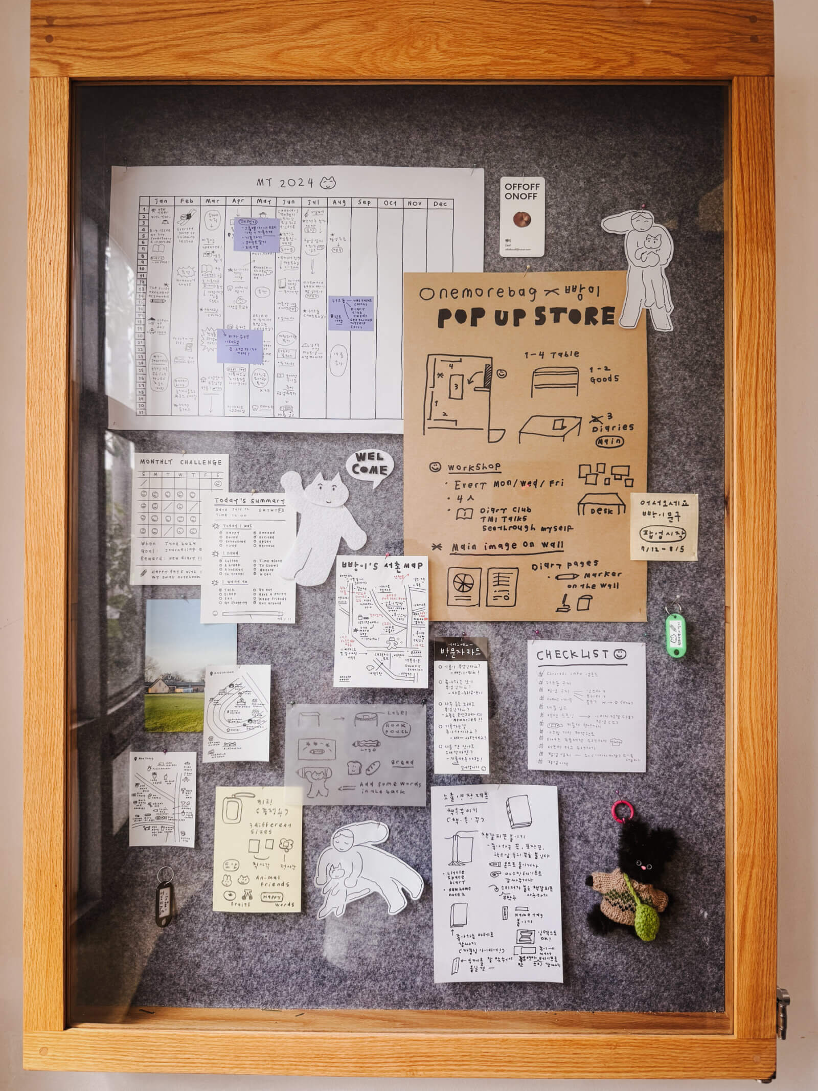
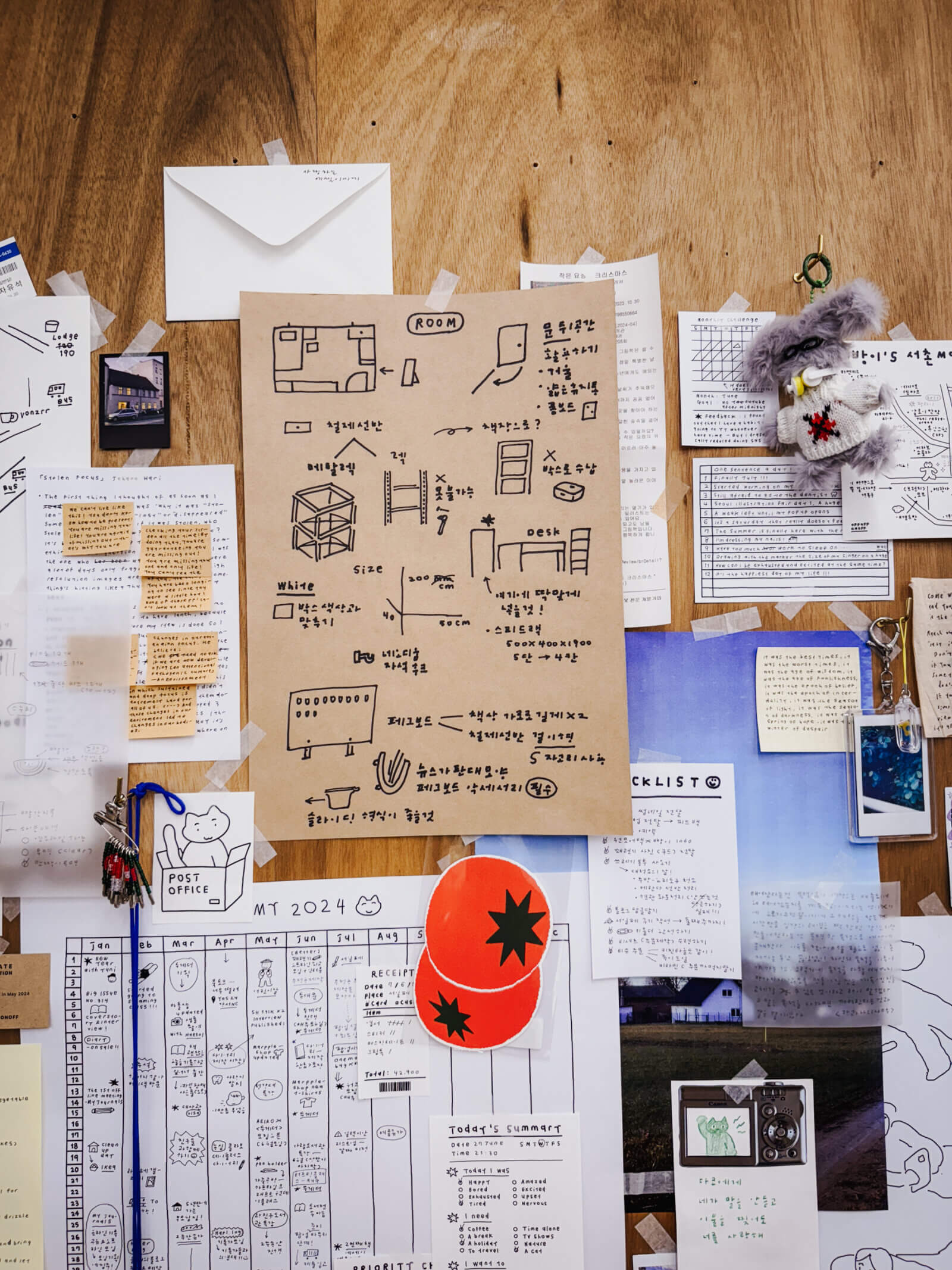
The first couple of days in korea we stumbled into a 3-storey stationery shop called Object. There was a particular section where they sell stationery and stickers by a particular artist with a distinct style I now call “ugly drawing”. By ugly I don’t mean it in a negative or derogatory way, I just mean it as a matter of description – like it is deliberately drawn in a messy, imperfect, inaccurate manner (pardon the quality of the photos, I took these casually and in a hurry, not expecting them to be used in a blog post):
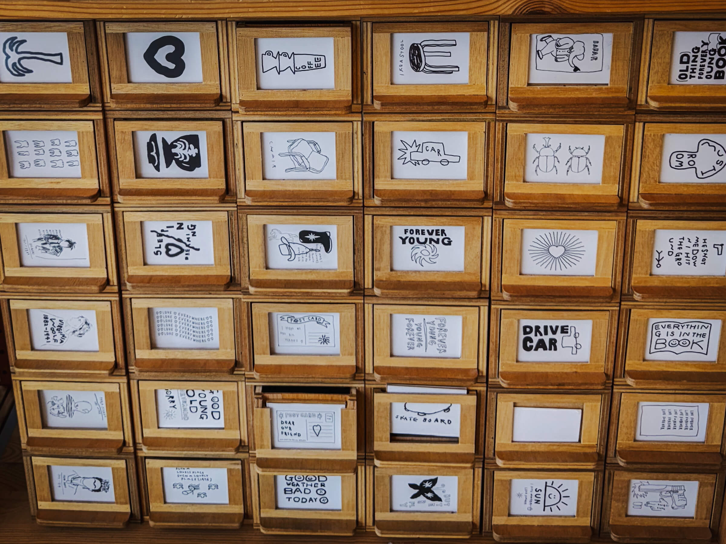
I remarked to my partner that we can draw anything, call it art and sell them as long as we think it is art. Although I personally call it “ugly drawings” it doesn’t mean I think it is easy. Somehow there is still a consistent style and they are amazingly still attractive and aesthetically pleasing.
This style of drawing seems to be a trend in korea as we travelled to several cities. I thought I’ll share a collection of them.
I really liked how the typography and layout complements the ugly drawings – makes me miss designing posters:
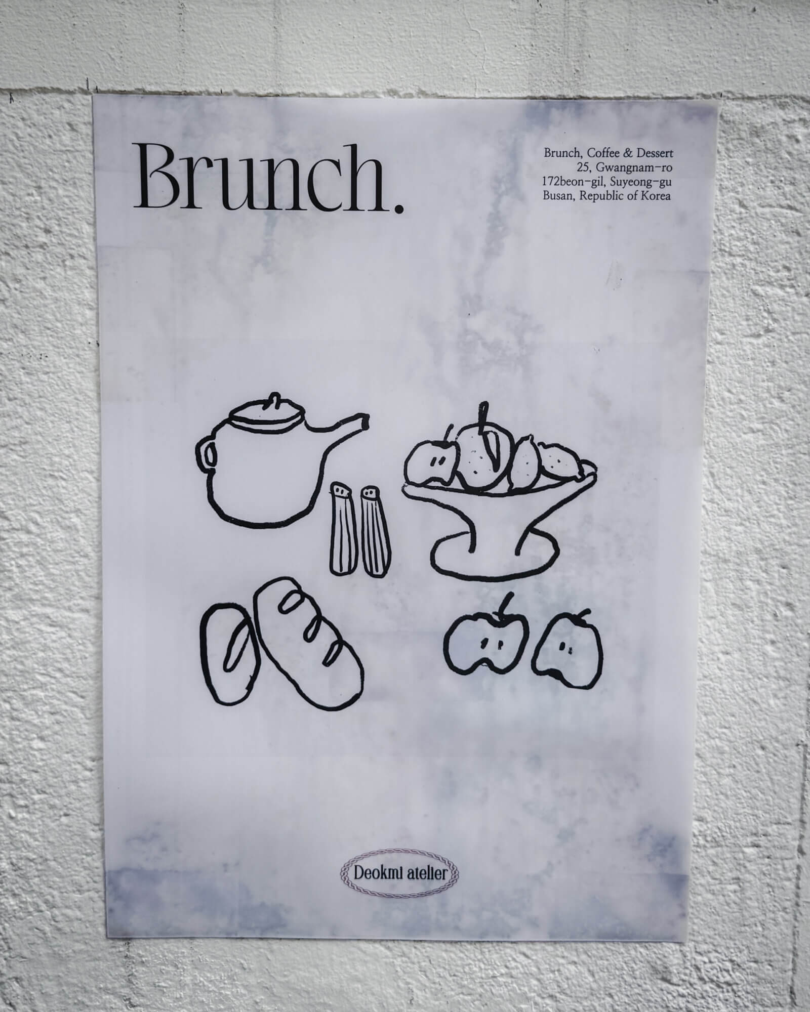
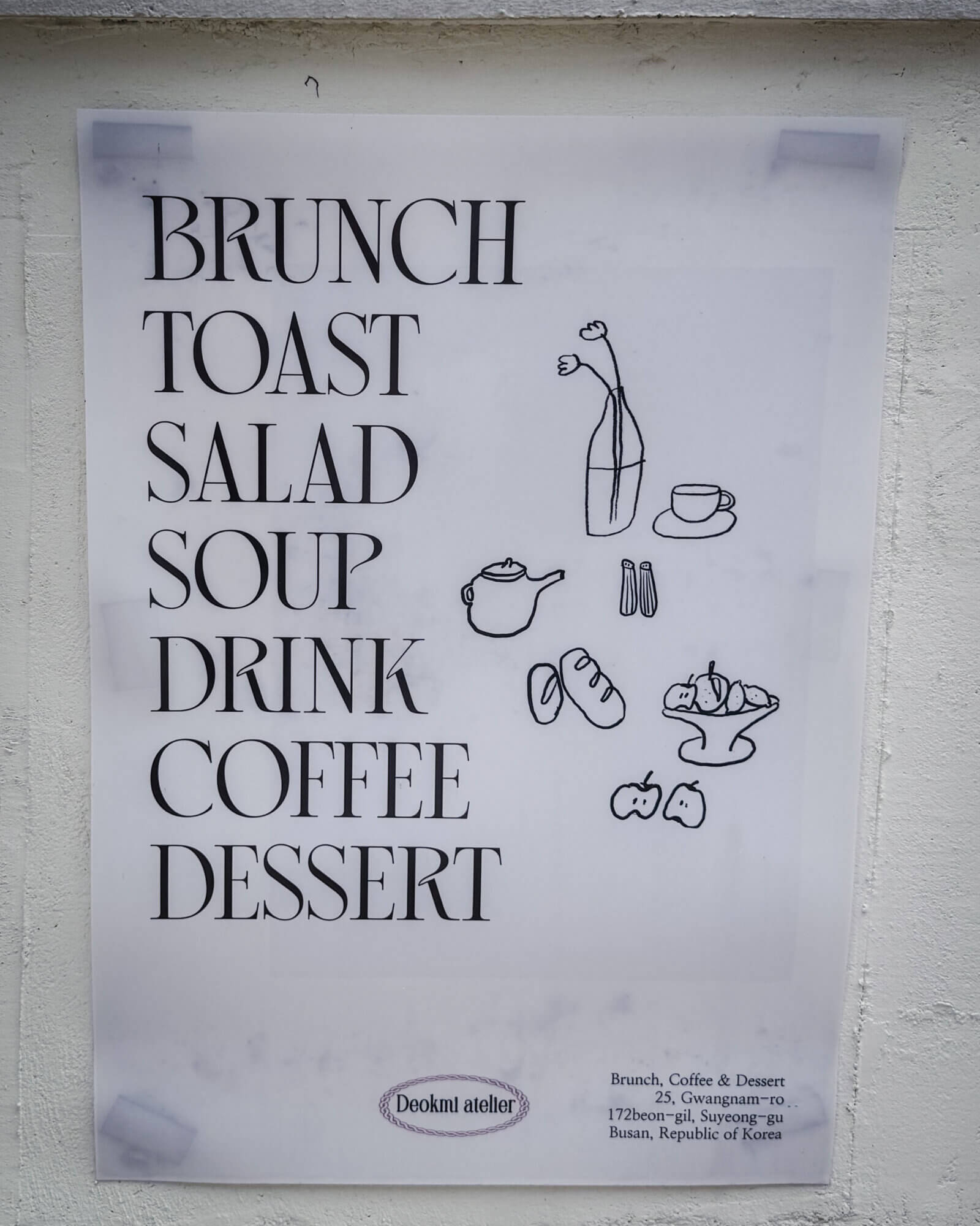
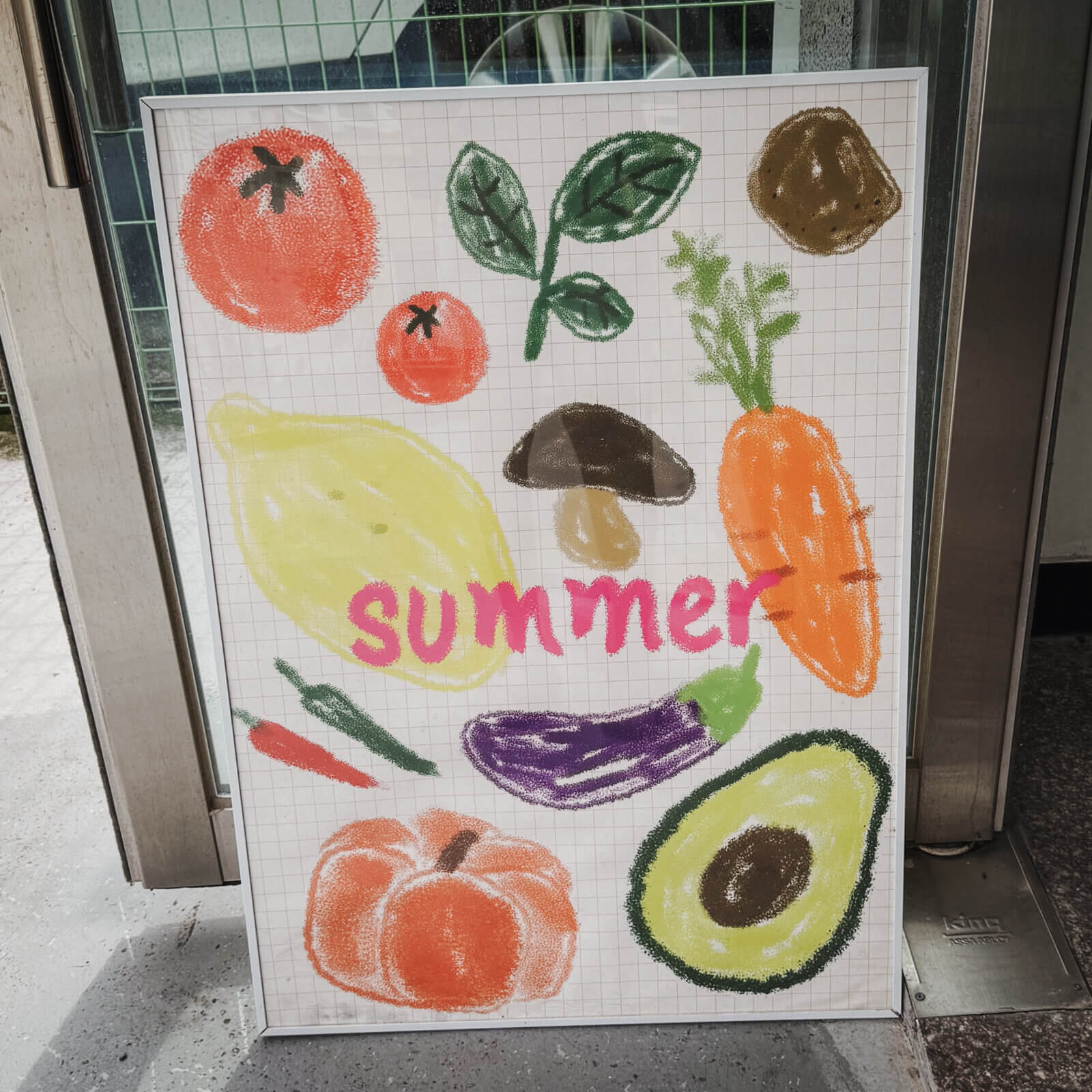
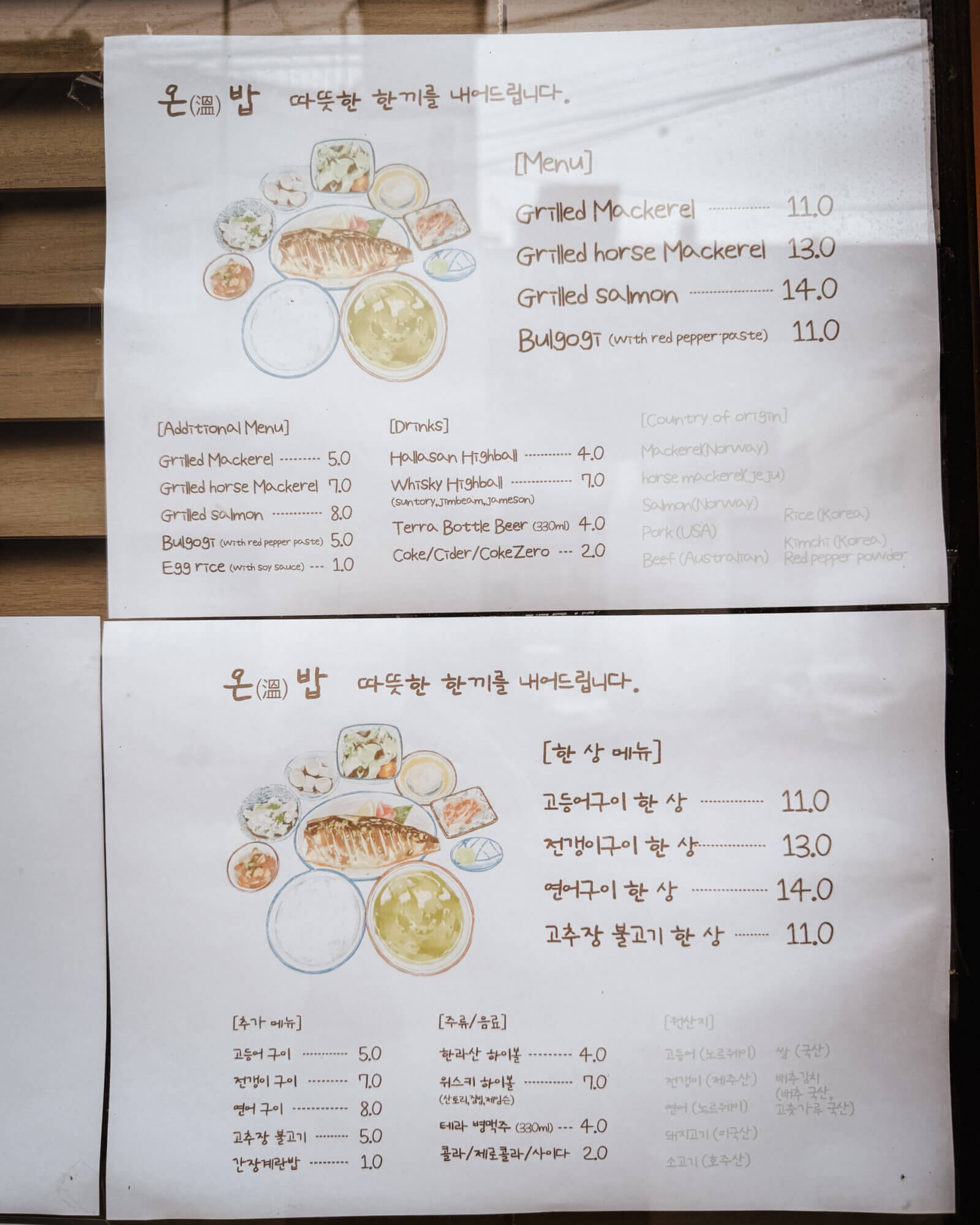
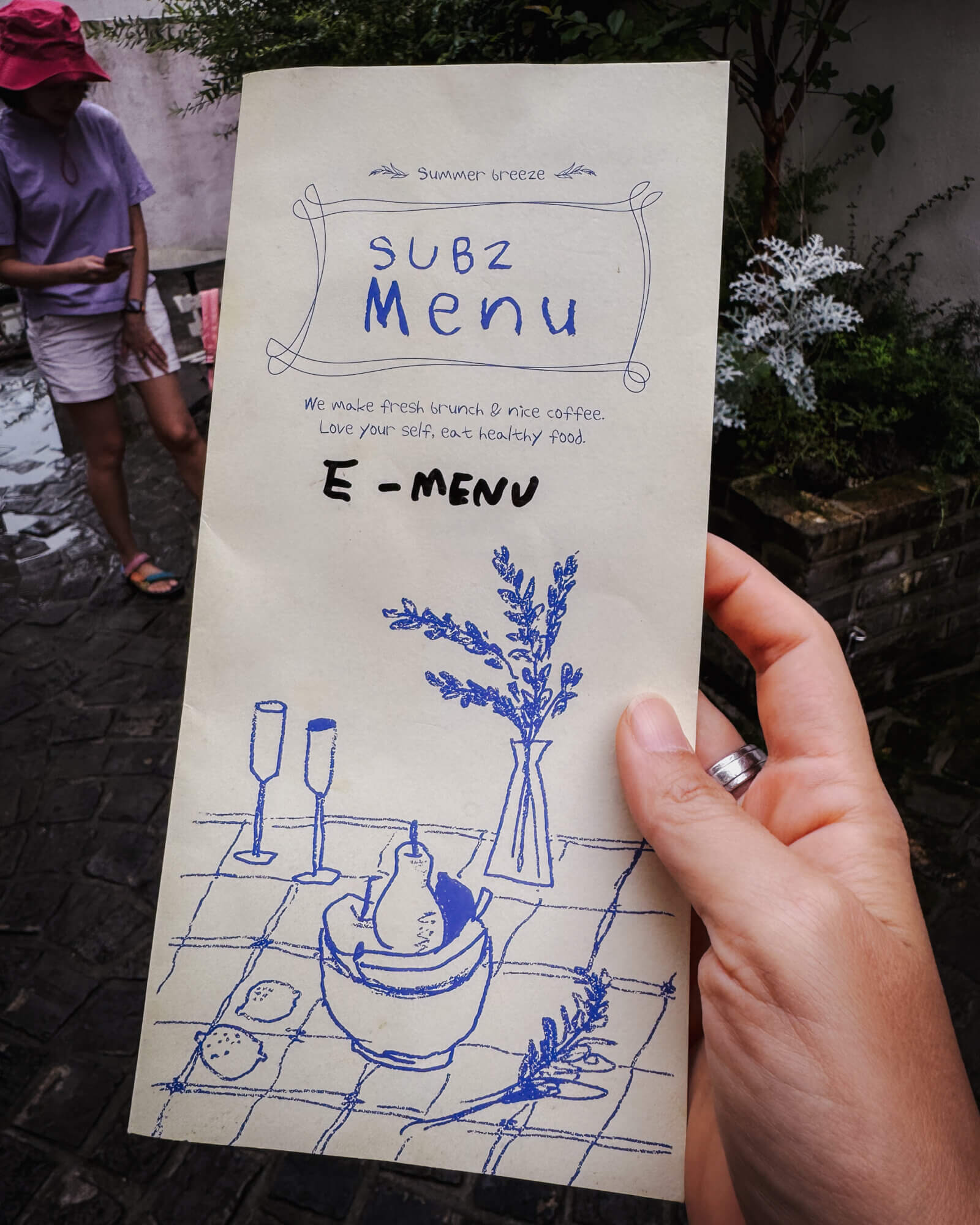
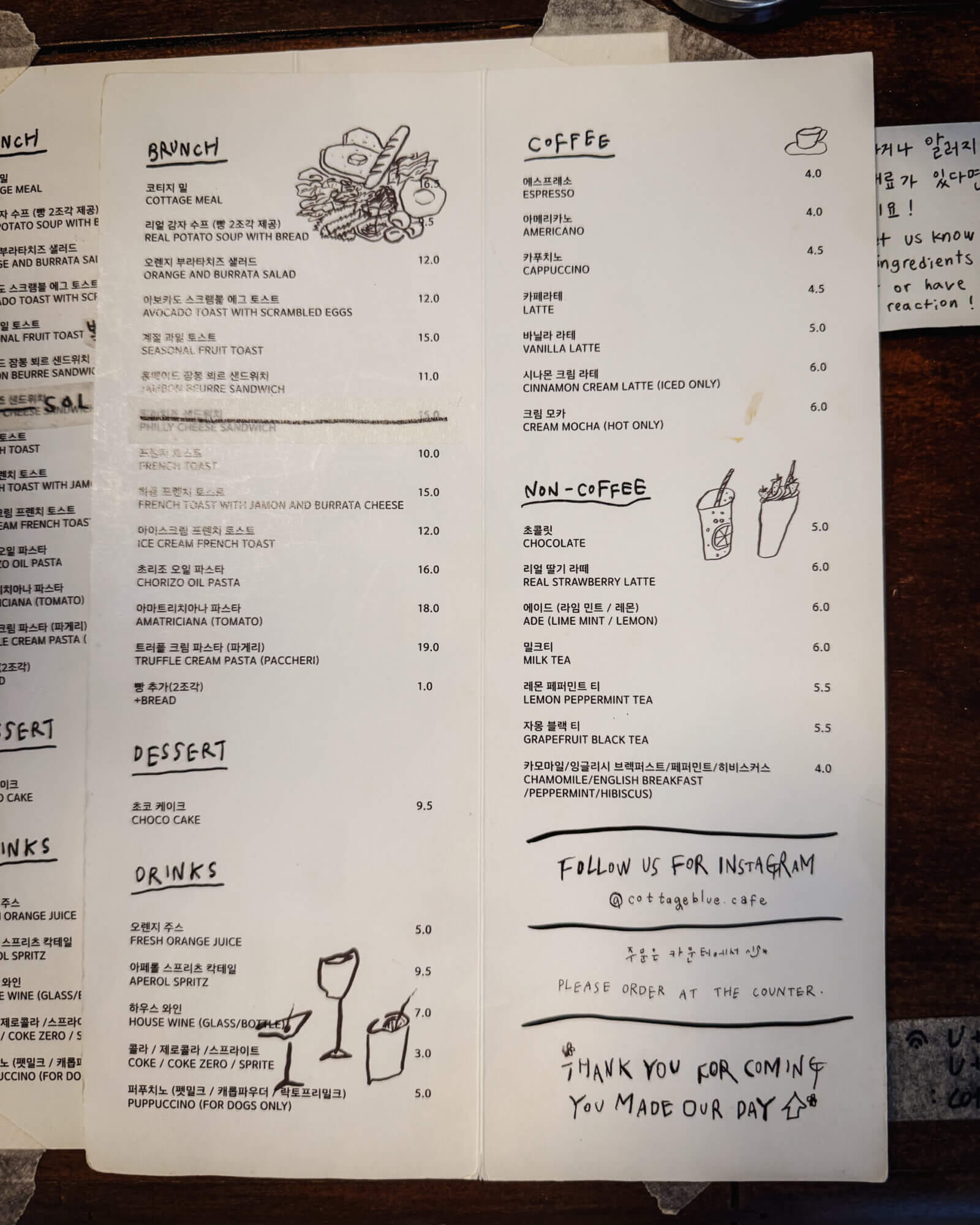
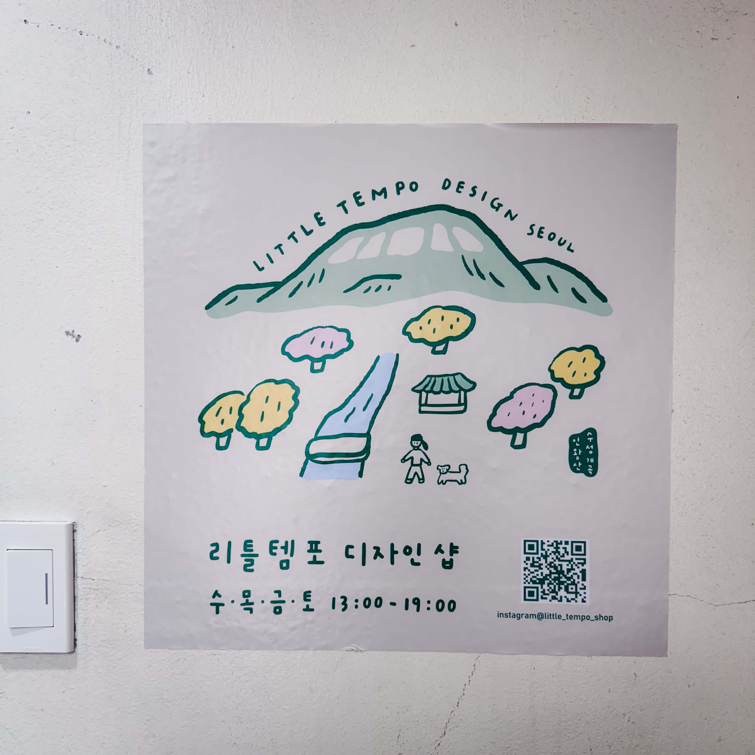
I think it was very interesting for me that many restaurants are opting not to use any food photography but they opt for illustrations in their branding, marketing materials and menus.
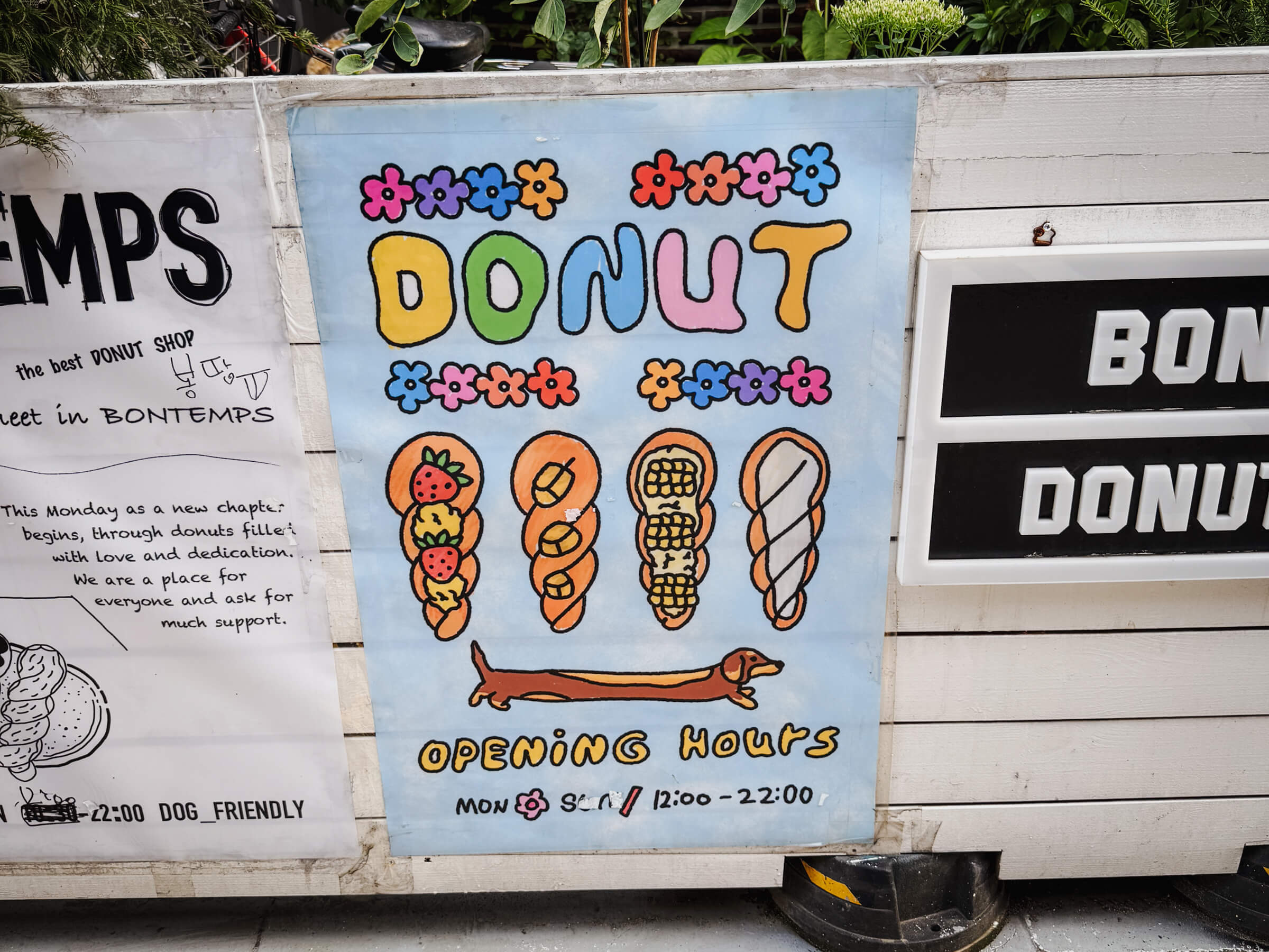
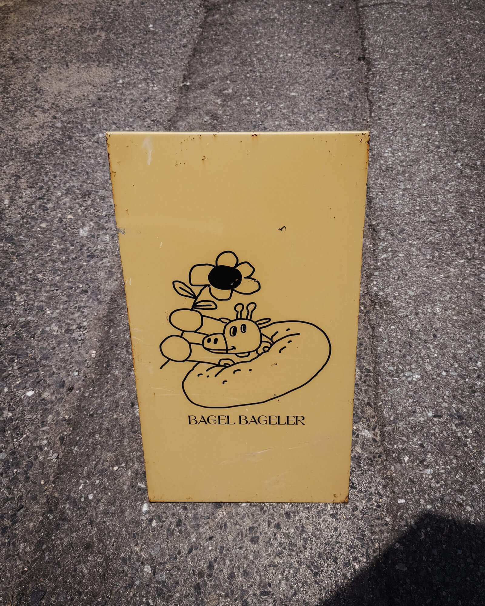
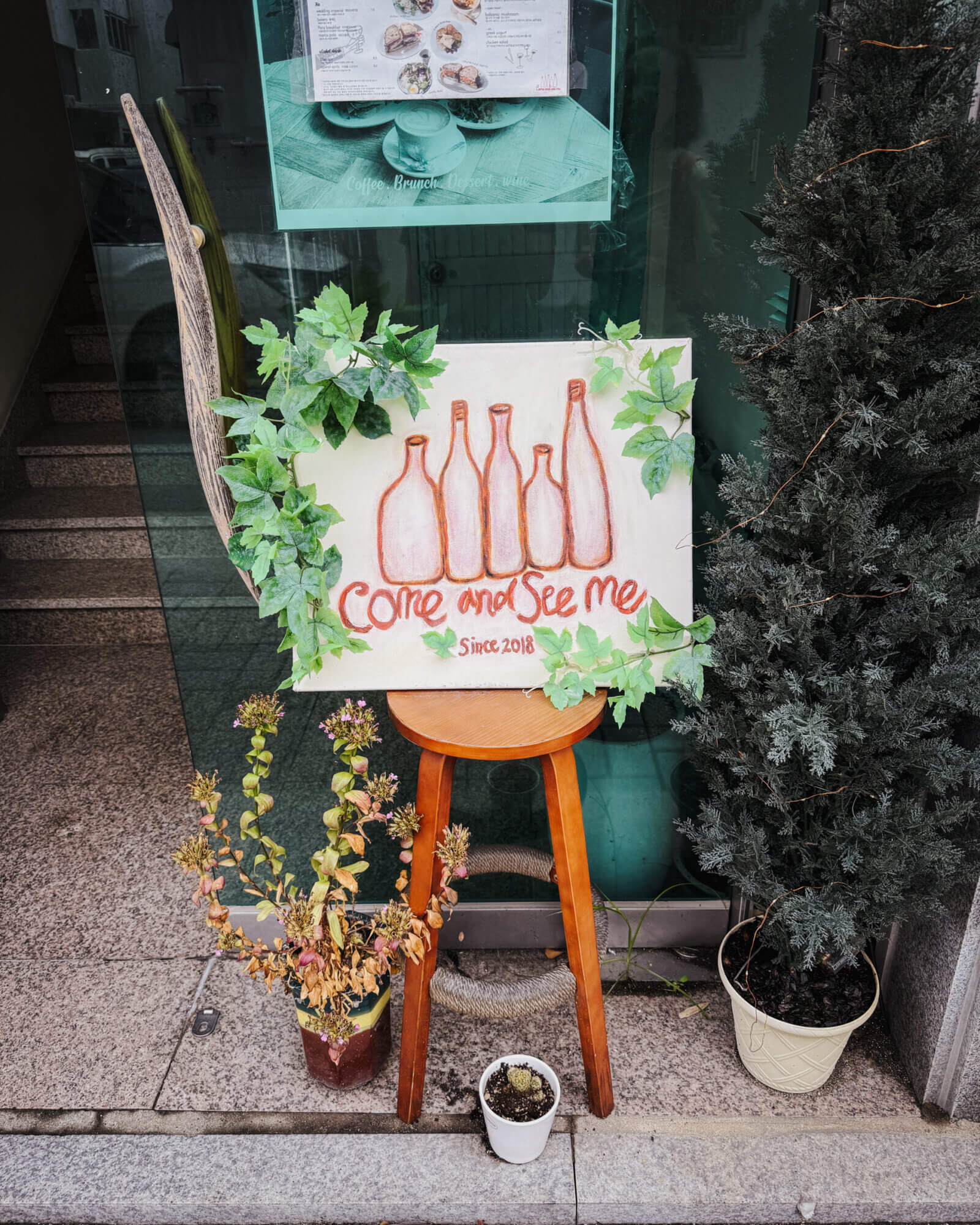
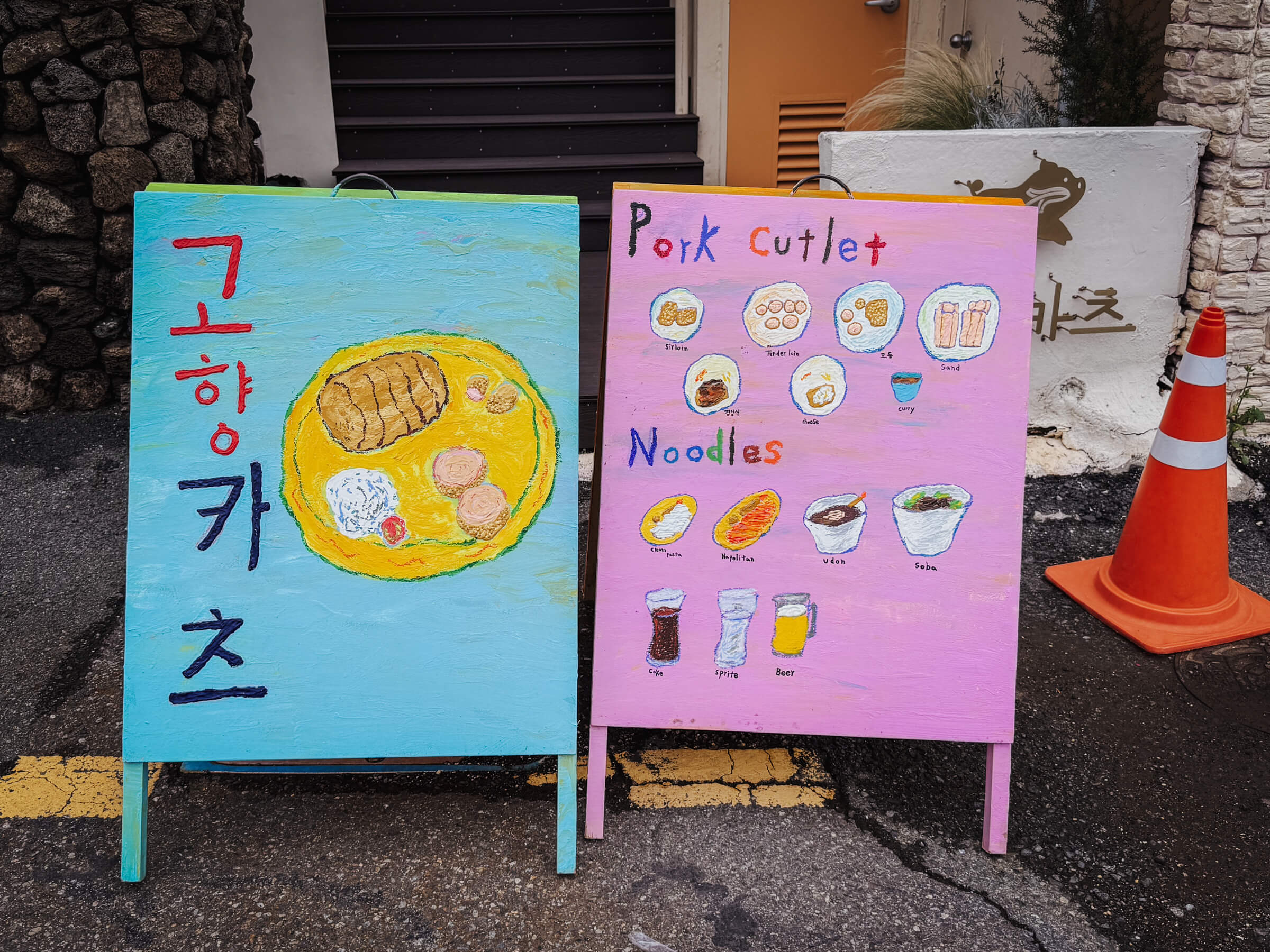
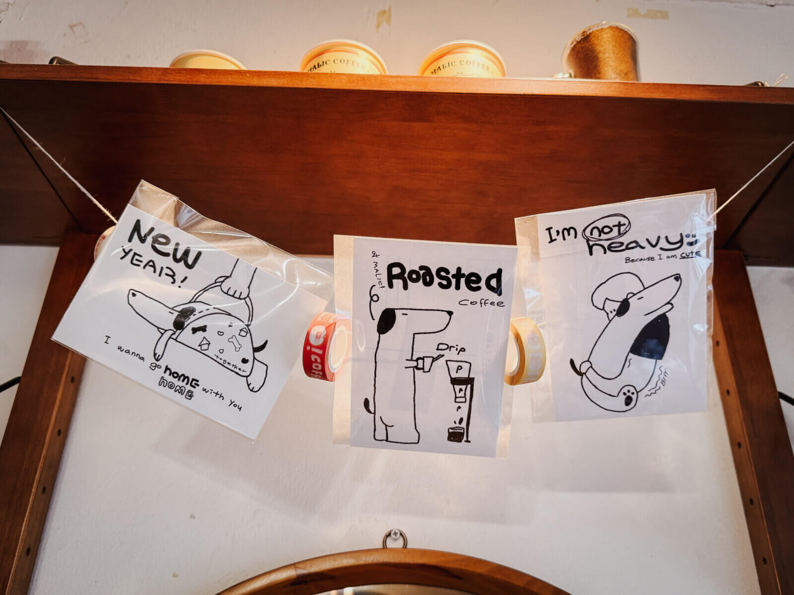
The illustration styles are pretty varied:
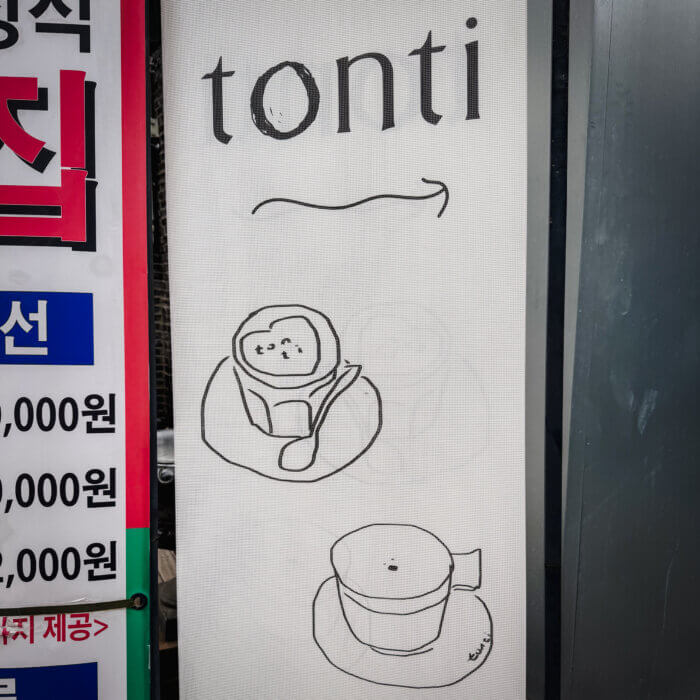
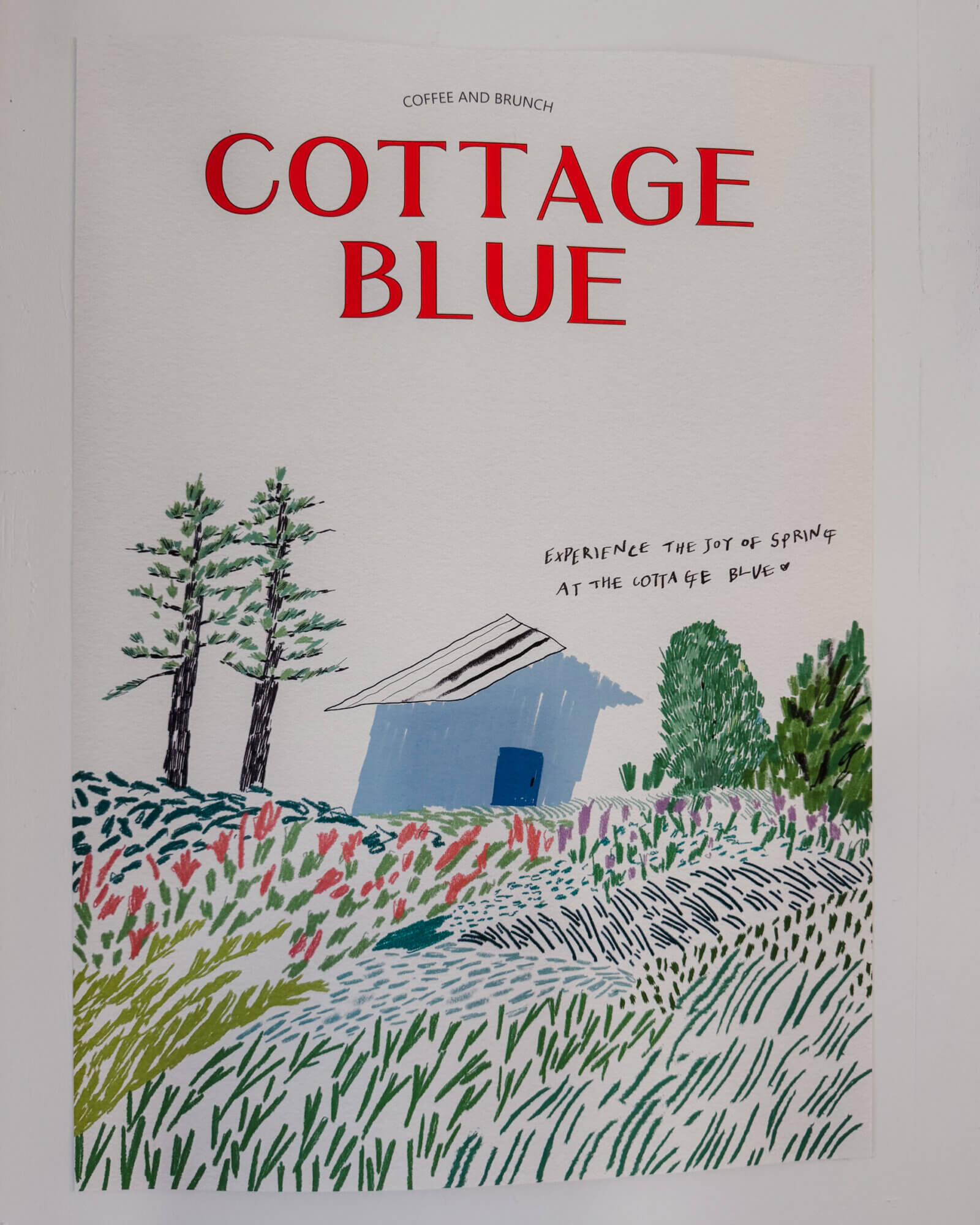
Are they saving on photography cost, or is it opting for a form of simplicity, in a rebellion against the polish?
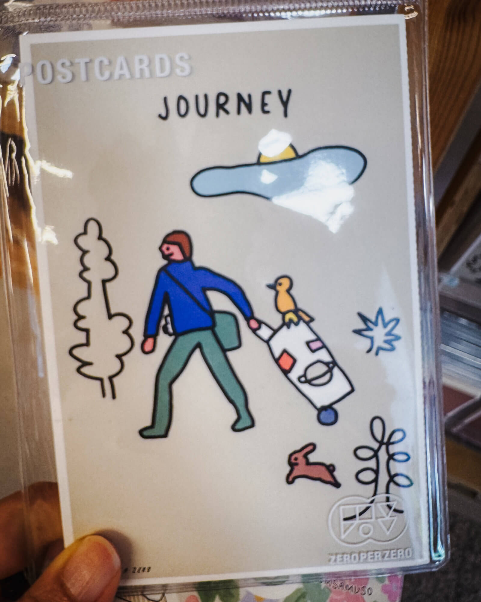
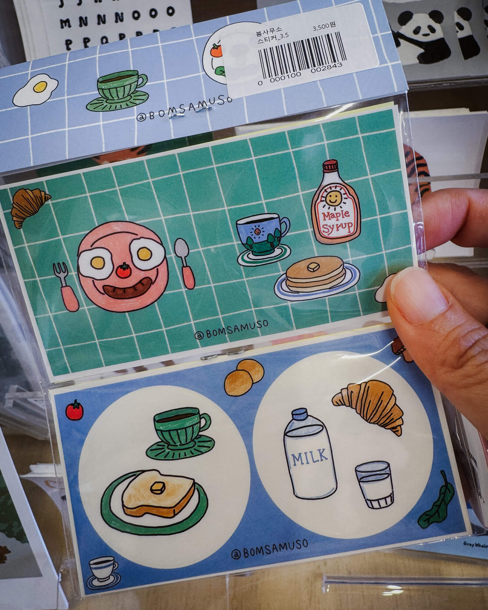
Many cafes also sell merchandise like postcards, washi tapes, and they often give out stickers for free (which my partner is a big fan of).
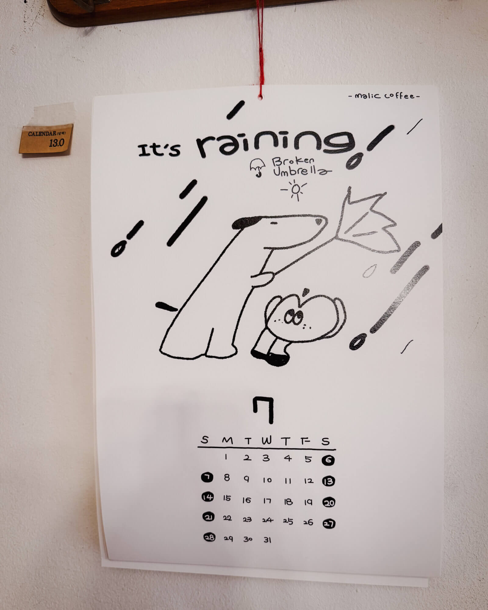
This cafe even has a similarly drawn calendar – makes me wonder if the cafe is just a front for the art:
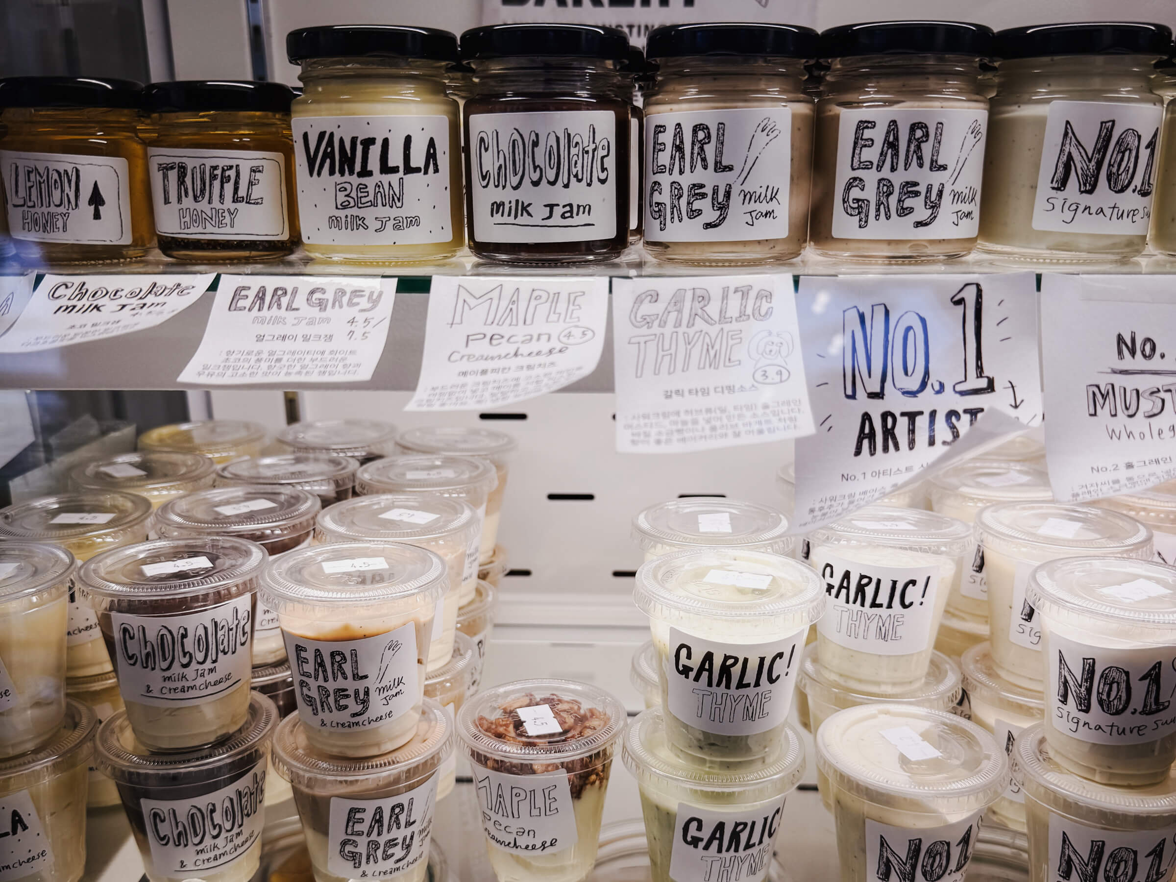
One of the most popular bakery cafe groups in Seoul owns London Bagel Museum, Cafe Layered and Artist Bakery, and they all have a similar aesthetic:
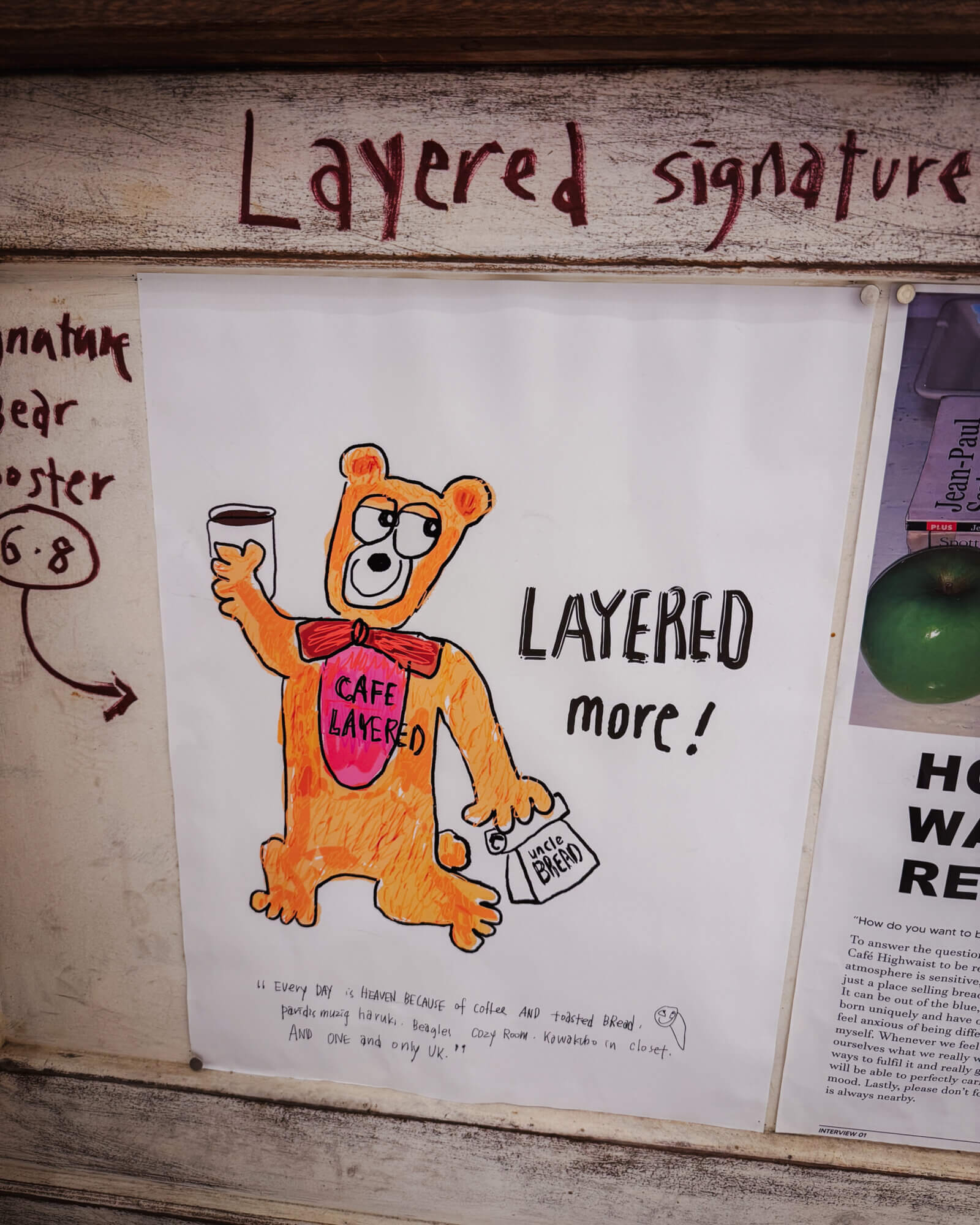
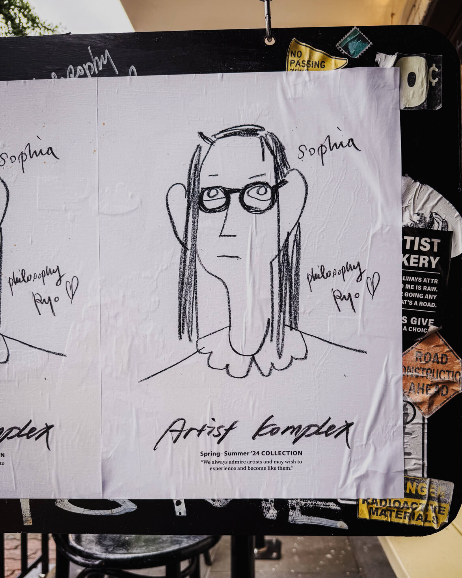
Love thee typography for their labels:
The resident artist seems to be also the founder. Visiting the cafes is an experience in itself, on top of the food (which is pretty good but I wouldn’t say it is mind-blowing). How does one combine taste with business acumen?
“Until now, I had never experienced the energy or vibe felt in a cafe, but here I felt for the first time that there was ‘density in the space.’ Even though I had never worked in F&B before, I was so shocked that I thought, ‘I want to change my job.’” – (translated quote) Lee Hyo Jeong
Density in a space. Even though it is a translation, but what a phrase and concept. What is it that makes going into a space feel like a delight, like going into a candy store? These bakeries are literally dense, even in the way they display their food.
This style of drawing/art extends to merchandise they sell in stationery stores:
The abstracted drawings almost makes me feel annoyed because they look so simple that it makes us feel anyone can do it.
But I feel like these are like those zen paintings with a lot of white space. They look deceivingly simple but there is an essence that is difficult to articulate. Or maybe it is just me, because I tried doing it and they look rubbish. My partner has also tried and she is too much of a perfectionist to go against her instincts, for now.
I love these though. I think it renders a sense of comfort that is difficult to find in this world nowadays. It reminds me of Hundertwasser, who proclaimed that straight lines will be the downfall of humanity.
Though I think most of these drawings are not that easy to emulate, I do think they carry an encouraging spirit: that anyone can be an artist, art doesn’t have to be only about precision, technique and symmetry. Do you feel encouraged after seeing these?
I personally feel inspired after seeing them.