Last weekend to celebrate our 94th month anniversary we decided to attend a beginner’s risograph workshop at Knuckles & Notch. To be very honest I haven’t heard of the word “risograph” until last year – and I actually worked in print design for a few years so that is a tad embarrassing. Back in my day (early 2000s) there were hardly any art fairs – or at least I was too busy working to know about them if they existed – there was also no zine or sticker culture like it is now.
We encountered risograph prints at the Illustration Arts Fest last year. They have a distinctive neon-ish retro look. There was also where we first encountered Knuckles & Notch, and since then we’ve been following them on instagram. That’s how my partner knew of their workshops, and she asked if I was interested. I was, but the idea of attending a three-hour workshop in covid times sounded a little precarious and exhausting to me, so I just pushed the idea aside.
But we ran out of ideas of what to do on our 94th month, so at the very last minute my partner popped the idea again, and this time I agreed albeit reluctantly. We decided to wear n95s for the entire workshop.
I enquired if we needed to bring our digital devices to work on the designs, but they said no, we’ll use their materials available on-site. Thinking it was somewhat like letterpress or woodblock printing I was anticipating doing some cut outs to make some simple prints. I was half right! They offered paper for cutting, and I was surprised to learn that we could actually draw anything with markers.
There is a set number of fixed colours which we could pick any 2, and we can dictate the transparency of the colours via shades of grey. The overlap of translucent colours may produce beautiful effects.
I decided to hand-letter a haiku I wrote in 2017 (because this was the sentiment I intensely felt at the particular moment in time), and opted to keep the colour scheme stupid simple. Since this is our first time, we had no idea what to expect or how to visualise the potential outcomes. Hence I was more conservative.
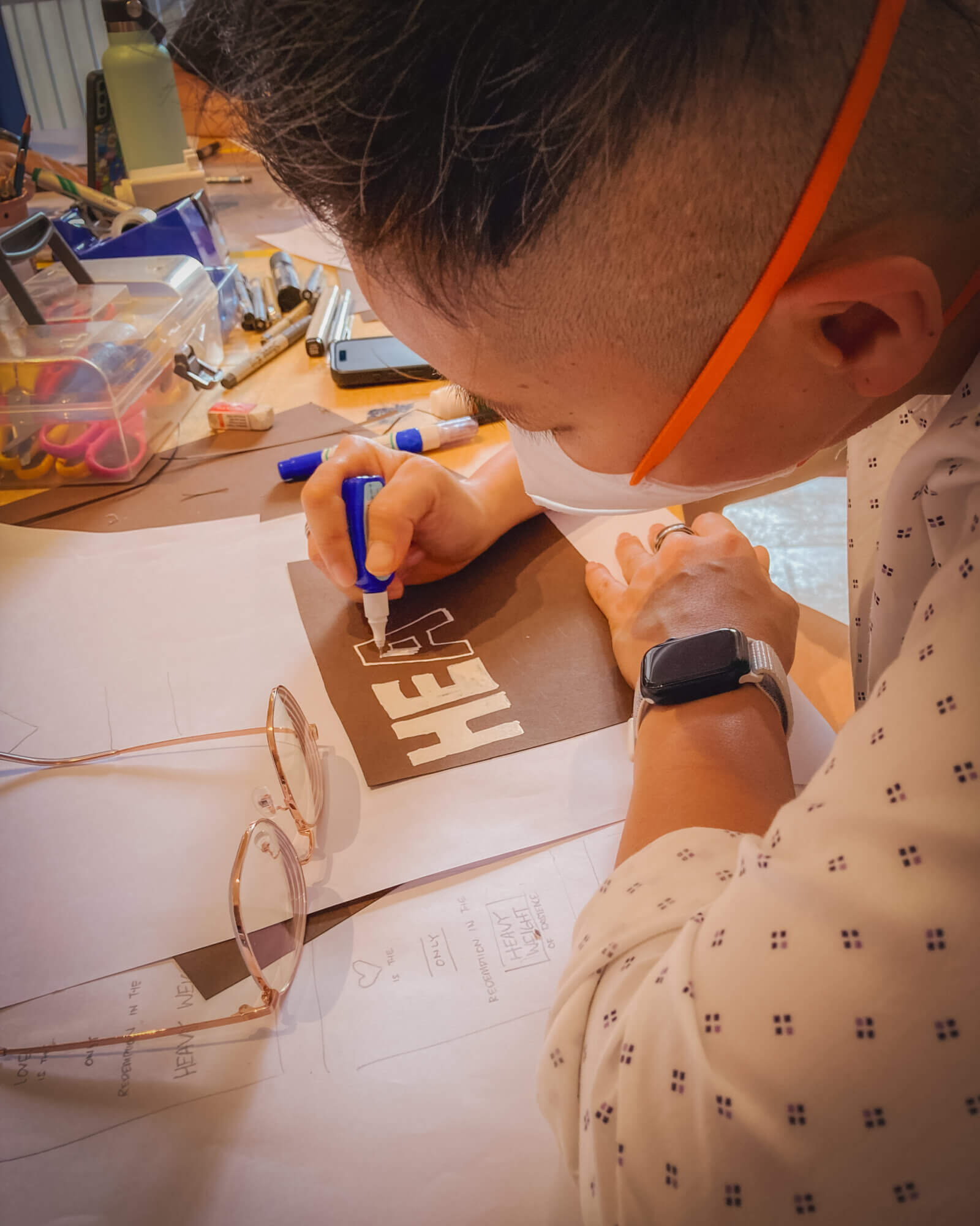
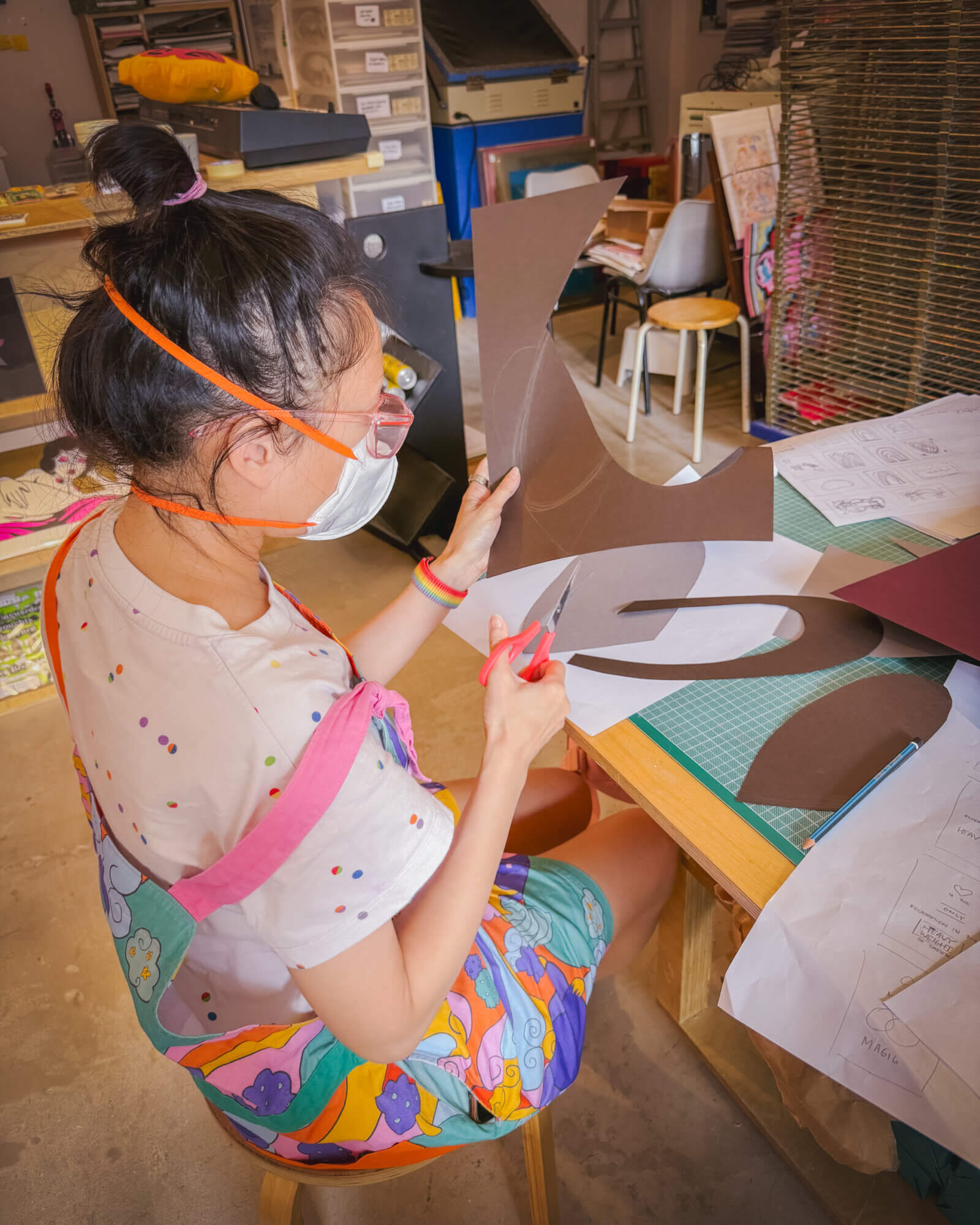
Here I am lettering with correction liquid to make white letters (my hand tired from perpetually squeezing, had I known earlier I would have brought my giant white posca marker), and my partner elected to cut shapes from paper:
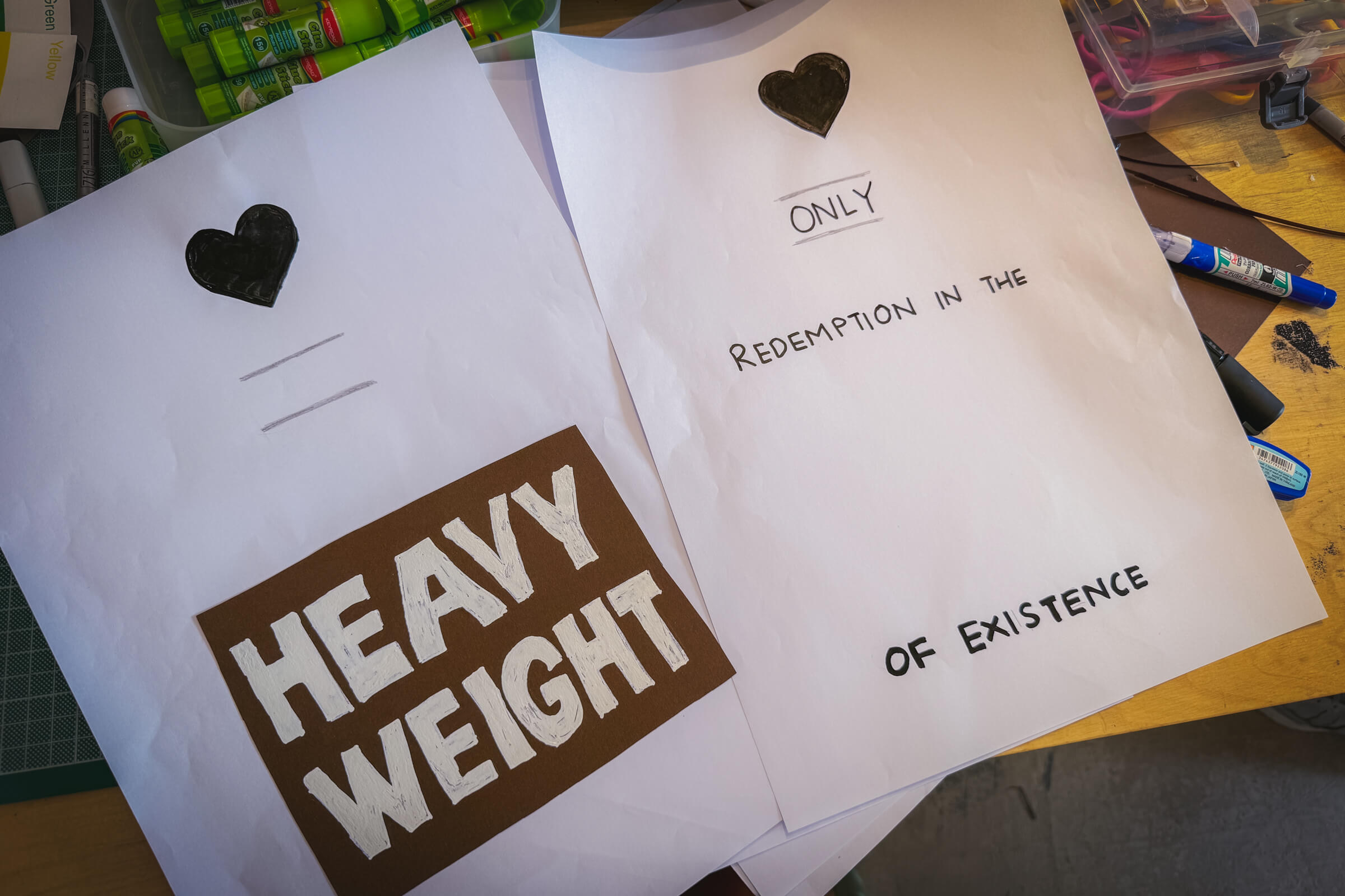
The lay outs of the separate two colours were created with a black marker and pencil. To create the giant block containing “heavy weight” I cut out some black paper and used correction liquid on it. The left would determine the pink areas and the right would determine dark blue areas:
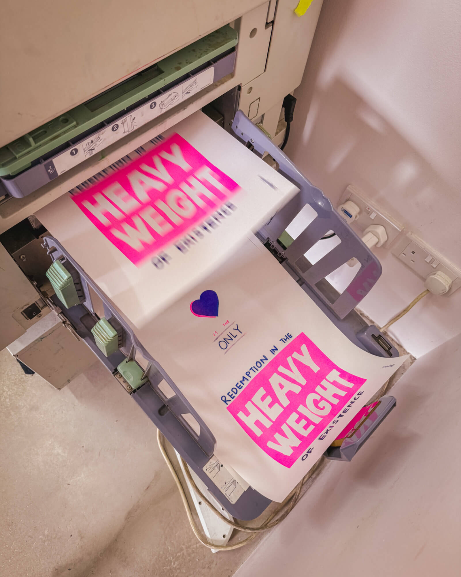
The risograph printer in action:

The risograph stencil:

My partner browsing risograph the art at the studio:
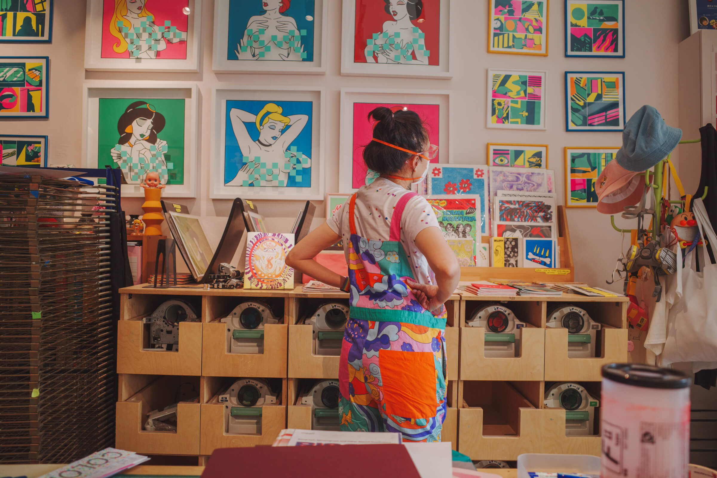
Close-up of the overlapping blue and pink hearts – this effect is not obvious on the poster when seen from a distance, but pretty cool up close. But on hindsight perhaps I would have used a grey marker for a more translucent blue:

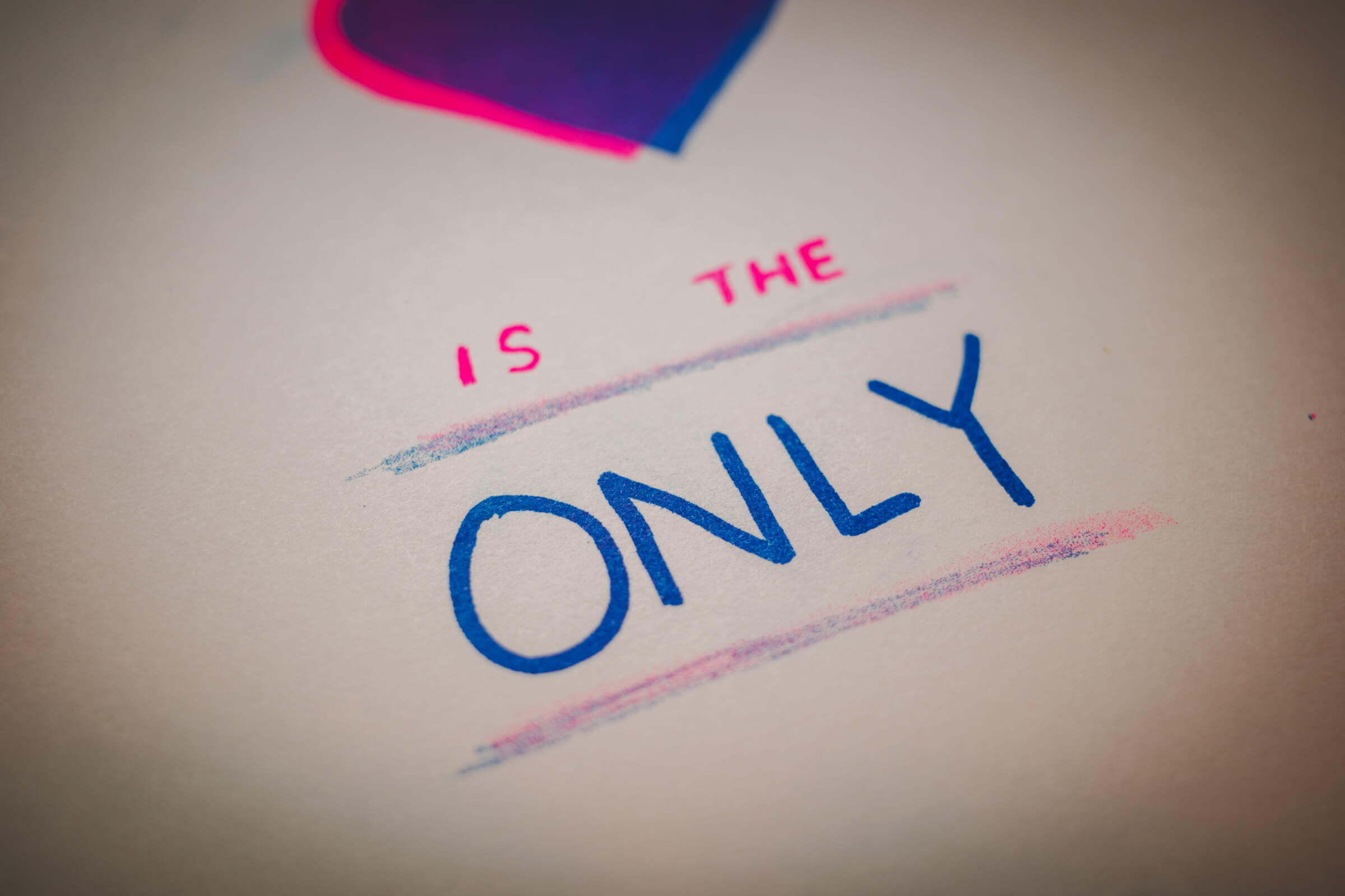
For the two lines that sandwich the word “only” I wanted to experiment with overlapping pencil lines. Since pencil is naturally grey (rather than solid black) I thought it would create an interesting effect with the overlapping colours. In the end the effect was pretty cool but I think it should have been more pronounced. Also since this is the first time I am hand-lettering blind I couldn’t balance the weight of the type properly – too used to being able to quickly toggle different typographic weights in a software. I felt this part of the poster was pretty weak:
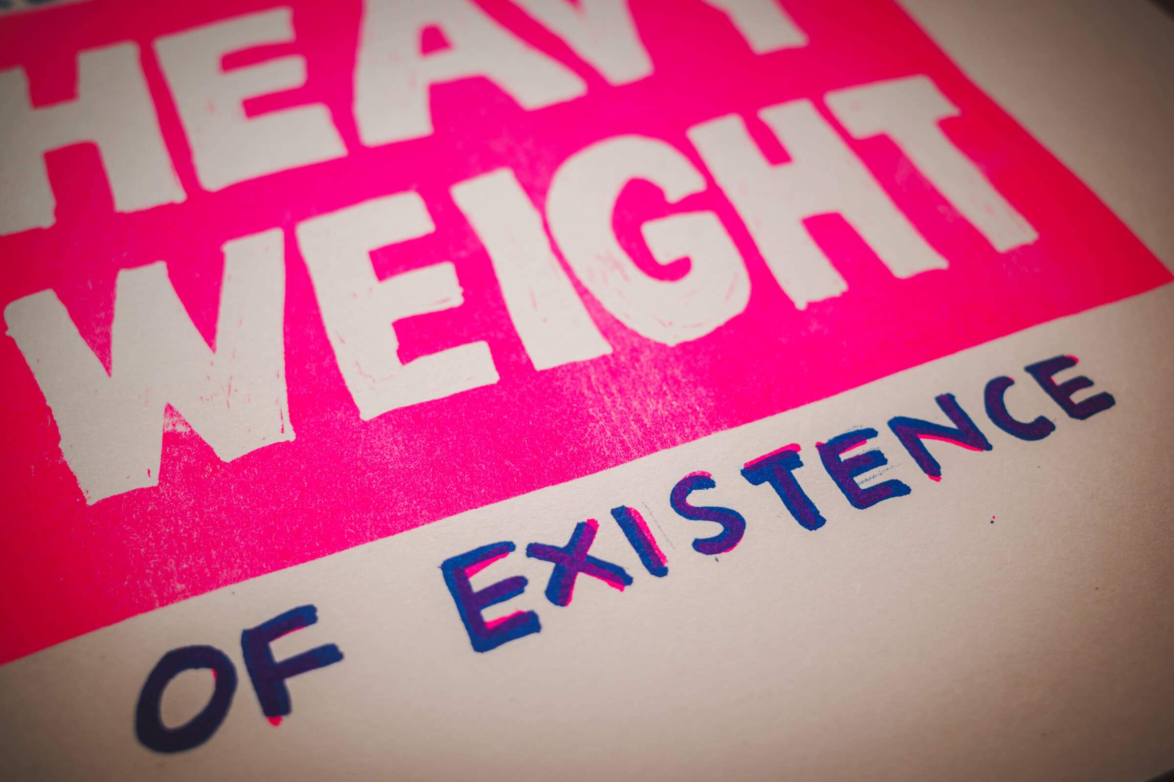
Another attempt at overlapping colours but again it wasn’t obvious except when seen close-up:
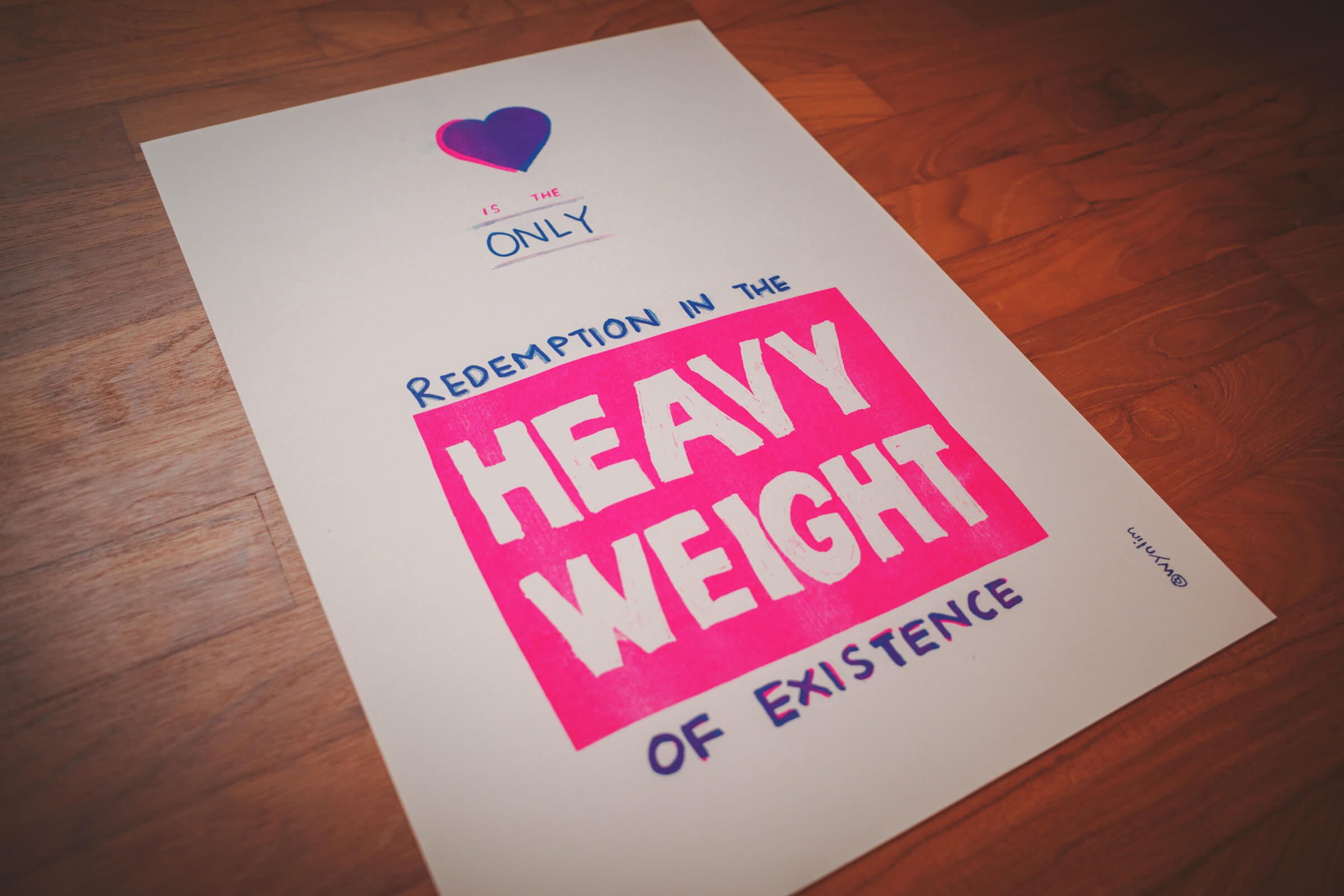
The full poster:
Us with our posters at the studio – the effect of my partner’s overlapping colours were so much better:

Overall this was a very enriching experience for me. It is so cool to create a poster almost entirely manually versus using a software. I regard my hand-lettering as trash but I wanted to see how far I could go with it. After this experience I guess I can see why there are so many artists who are enamoured with risograph prints. It offers a different spectrum of creativity and creative constraints that often produces extraordinary results. I mean the only reason why we became aware of it is because the risograph prints at the art/book fairs kept catching our eye.
I’ve spent so much of my life creating with the computer and making digital visuals. I think there is some evolutionary biological reason why we are very drawn to analog things. When I first started to learn how to draw I thought I would be happier drawing on the ipad. I was wrong: I feel so much better sketching with a pen and painting with watercolour.
Risograph prints can never be perfect. My hand-lettering would never look like type set on a computer software. But there is perfection, and then there is beauty. The more encounters I have the roughness that comes with handmade and analog stuff, the more I am moved by the beauty that emanate from those layers of rough imperfections. Is it because nature is also never perfect? That the petals of flowers are never symmetrical, there is always a browning leaf on a tree. We gasp during autumn, when things start to decay. There can be an exhaustion that comes with endless summers.
p.s. I’m giving away five copies of the poster with free shipping if any of you deem it worthy. please leave a comment and i’ll get in touch with you.